No Collections Here
Sort your projects into collections. Click on "Manage Collections" to get started

Volopath
My Role:
Project Time:
The Challenge:
UX Researcher, Prototyping, Usability Tester, Workshop Facilitator, UX/UI Designer
5 weeks
The goal was to create a platform that connects volunteers with meaningful opportunities while overcoming common barriers such as time constraints, unclear guidance, and inconsistent engagement. Many individuals want to contribute to social causes but struggle to find flexible and accessible volunteer opportunities. Non-profits also face challenges in maintaining long-term volunteer engagement, which impacts their sustainability.
The solution was to design an intuitive app that bridges the gap between volunteers and causes. The app enables users to engage with meaningful work locally and globally, even while traveling. By simplifying the volunteer process and providing clear direction, the platform fosters greater community involvement and social impact. The goal was to offer a flexible and accessible solution that makes contributing to social causes easier and more rewarding for both individuals and non-profits.
The Solution:

Empathize Phase
Qualitative Research
I interviewed 5 potential users to understand the challenges they face when seeking sustainable travel options. Some sample questions included:
-
What obstacles do you face when choosing eco-friendly travel options?
-
Where do you typically find information on sustainable travel?
-
What motivates you to travel sustainably, and what makes it difficult to maintain?
-
How much effort are you willing to put into finding eco-friendly travel options?
-
What would make it easier for you to adopt more sustainable travel habits?
-
How does price affect your choice of sustainable travel options?
-
How important is it for you to track your carbon emissions while traveling?
Key Findings
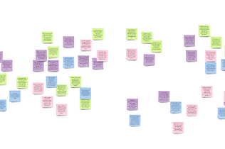
Affinity Mapp from User Interview
-
Sustainable travel often takes more time and effort, making people prefer faster options.
-
Higher prices for eco-friendly choices discourage many, even with long-term benefits.
-
Users want simple, reliable information about eco-friendly choices.
-
A feature to measure and compare carbon emissions would be valuable.
-
People are motivated by saving time and money, so cost-effective solutions are key.
-
Social media like “Tiktok” and Google are key sources for sustainable travel info.
Competitive Analysis
Building on the survey insights, I conducted a competitive review to analyze leading companies in the sustainable travel sector. This helped identify their strengths, weaknesses, and growth opportunities, guiding us in refining our approach to stand out in the market.

Define Phase
Personas
I created a user persona to illustrate the target audience for the application.

Ideate Phase
An ideation workshop was held with four remote participants using Miro. I facilitated the session, applying divergent thinking techniques—brainstorming, mind mapping, and the MoSCoW method—to generate and prioritize ideas. I also created a visual flow map in Miro to illustrate the app's user navigation from one screen to the next.


Brainstorm
Mindmap
MoSCoW method
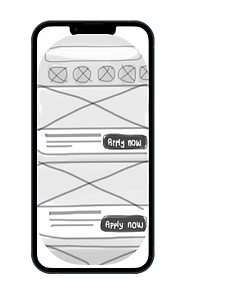
Selected Solution: Concept 2: Apply from Search Results. After evaluating the pros, cons, and conducting a SWOT analysis, this concept was chosen for its speed, simplicity, and seamless user experience. It allows users to apply directly from search results. While challenges like potential confusion exist, they can be addressed with clear design. Concept 2 is scalable for future enhancements, offering a fast, mobile-friendly process that aligns with research and reduces friction.
Selected Solution
User Flow
I used Figma to create a visual map of how users will navigate through the app, showing the steps they will take from one screen to the next.

Prototype

High-Fidelity Wireframes
I started by sketching low-fidelity wireframes on paper, making revisions based on UX guidelines. After that, I moved on to designing the high-fidelity wireframes in Figma.
Test
Usability Test Tasks
-
Create a Profile: Sign up and create an account with email.
-
Apply for an Opportunity: Use the one-click apply feature for a food distribution program.
-
Search for Opportunities: Find volunteer opportunities in Bali available on weekends.
-
Update Profile: Add a new skill ("Team Leadership") in the profile settings. Contact Support: Navigate to the help section and reach out to customer support.
Key findings
Error Recovery and Complex Messages Problem:
-
Errors lacked clear recovery instructions and technical error messages were unclear.
-
Key finding: Users struggled to correct errors, increasing frustration and abandonment.
-
Improvement: Use real-time validation, simple error messages, and clear recovery steps.
Personalization Limitations Problem:
-
Limited customization options, like theme or notification settings.
-
Key finding: Users felt the app was too rigid, reducing engagement.
-
Improvement: Add customization features like themes, notifications, and layouts.
Difficulty Accessing Help Problem:
-
Help/support options were hard to find.
-
Key finding: Buried menus led to frustration and abandonment.
-
Improvement: Make help more accessible with a visible button or in-app chat.
No Progress or Favorite Saving Problem:
-
Users couldn’t save progress or favorite items.
-
Key finding: Users had to repeat actions, leading to frustration.
-
Improvement: Add progress saving and favorite features for convenience.
Conclution
This project successfully created an intuitive app that bridges the gap between volunteers and causes, addressing key challenges like time constraints and unclear guidance. By simplifying the volunteer process and offering a flexible, user-friendly platform, the app fosters greater community engagement and social impact. Key improvements, such as better error recovery, personalization, and easier access to support, will further enhance the user experience moving forward.